Two AI Frontend Design Experiments: GPT vs Gemini vs Claude vs Kimi vs Grok vs GLM vs MiniMax
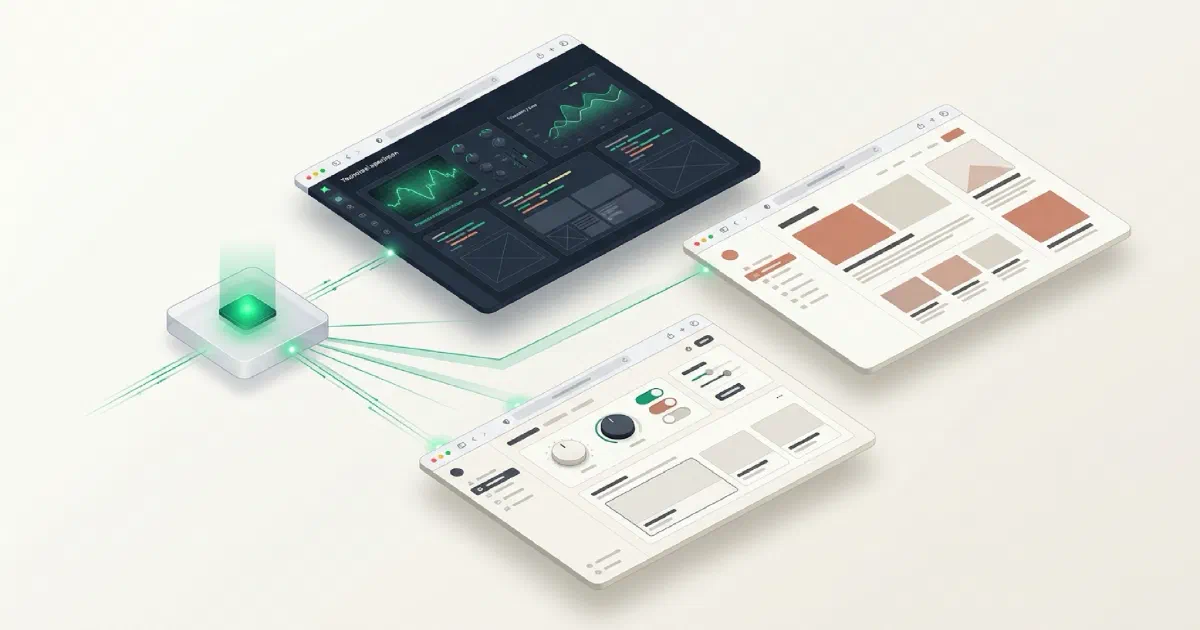
My conclusion after two rounds: AI-generated frontends have not converged to one universal aesthetic. Under low-constraint design prompts, different model/harness combinations repeatedly exposed different visual preferences. OpenAI tended to be strong at physical spaces and mature commercial branding; Gemini leaned toward concepts and interactive experiments; Claude Sonnet behaved more like a product/brand designer; Kimi was strong at Chinese typography and editorial direction; Grok leaned cinematic and theatrical. Instead of asking which model has the “best taste,” I now use those recurring biases as a multi-model design pitch pool.
If you use AI to generate frontends often, you probably know the pattern: ten different AIs produce ten websites, and eight of them somehow look related—large headline, rounded cards, blue-purple gradient, glassmorphism, three feature columns.
I kept wondering:
Why do AI-generated frontends keep converging? Can different models actually produce meaningfully different art directions if I stop over-specifying the style?
This article records two rounds of experiments.
Round one used the theme “an indie developer’s archive of AI-made things” and focused on each model’s own design prior.
Round two switched to a completely different brief: “a late-night dessert shop that only opens when it rains.” That forced the models out of the AI/developer visual comfort zone, and Claude joined the test in this round.
After both rounds, the design personalities of several model families became much easier to see.
Why I changed my old workflow
My older workflow was:
ChatGPT creates a design image first, then GPT, Kimi, or another coding agent implements it.
The problem was obvious. The implementation often converged back toward the same generic AI aesthetic.
For these experiments I changed the rules.
I asked the model itself to act as Art Director + Frontend Developer.
I did not prescribe a specific visual style. I only defined the subject, required content, and things to avoid. The model had to deliver a complete one-shot HTML page.
The point was to expose the model’s own design prior instead of making every model implement the same upstream mockup.
Method and limitations
- Each round used one shared prompt across the models participating in that round.
- Each model could output only one complete, directly runnable HTML file with inline CSS and JavaScript.
- No external image assets. If the design needed visuals, the model had to create them with CSS, SVG, or Canvas.
- I checked both desktop and roughly 390px mobile layouts.
- This was not a code benchmark. I cared about art direction, visual differentiation, typography, color, original graphics, interaction, finish, and responsiveness.
- Model and harness were not fully separated. Except for High/Max comparisons inside Pi, most results should be interpreted as model × harness, not pure model performance.
- The first Gemini 3.8 Flash result was invalid because of a working-directory problem. I reran it separately in Antigravity CLI and Antigravity IDE, and both clean runs are included below.
Round-one prompt: original Chinese text
The actual prompt used in the experiment was Chinese. I am keeping it verbatim because prompt language is part of the test.
请设计并实现一个完整的单页 HTML 网站,主题是:
「一个独立开发者的 AI 造物档案」
这个人平时会用 AI 做小游戏、工具、实验性项目和一些奇怪但有趣的东西。网站用于展示他最近做出来的作品,而不是卖课或宣传公司。
页面需要包含:一个有记忆点的首屏;当前正在折腾的项目;4~6 个已经完成的作品;最近的实验 / 更新记录;一个简单但有个性的 About。
请你自己决定整体视觉方向、排版、字体、色彩、留白、组件形式和交互方式。我不想指定具体设计风格,我想看你的设计判断。
但请避免典型 AI / SaaS 模板感:不要默认紫蓝渐变;不要满屏玻璃拟态;不要所有内容都塞进大圆角卡片;不要千篇一律的「巨大标题 + 三张功能卡片 + CTA」;不要用 Emoji 充当主要图标。
希望它看起来像一个真正有审美的独立设计师 / 开发者认真设计过的个人网站,有明显的视觉个性和细节,但不要为了炫技牺牲可读性。可以加入克制的 hover、滚动、微动效和有趣的小细节。
要求:只输出一个可以直接打开运行的完整 HTML 文件;CSS 和 JavaScript 全部包含在 HTML 内;桌面和手机都要适配;不依赖图片素材;页面里的中文文案也请你自己写;不要先解释设计方案,直接完成成品。
请把它当成一个真正会放进你自己作品集的项目来设计,而不是前端能力演示。
English translation of the round-one prompt
Design and implement a complete single-page HTML website around this theme:
“An indie developer’s archive of things made with AI.”
This person uses AI to make small games, tools, experimental projects, and strange but interesting things. The site should showcase recent work rather than sell courses or promote a company.
The page should include: a memorable hero; projects currently being explored; four to six completed works; recent experiments/updates; and a simple but distinctive About section.
Decide the visual direction, layout, typography, colors, spacing, component forms, and interactions yourself. I do not want to prescribe a design style. I want to see your design judgment.
Avoid the typical AI/SaaS-template look: no default blue-purple gradient; no wall-to-wall glassmorphism; do not put everything inside large rounded cards; avoid the standard “huge headline + three feature cards + CTA”; do not use emoji as the primary icon system.
It should feel like a personal site that a designer/developer with real taste spent time designing. Give it visual personality and details without sacrificing readability for spectacle. Restrained hover states, scrolling effects, micro-interactions, and small playful details are welcome.
Output only one complete HTML file that can be opened directly. CSS and JavaScript must be inline. It must work on desktop and mobile. Do not depend on image assets. Write the Chinese page copy yourself. Do not explain the design first—deliver the finished page.
Treat it as something you would genuinely put in your own portfolio, not as a frontend capability demo.
Round one: 11 valid samples
| Model / Harness | Main design personality | What I observed |
|---|---|---|
| Pi · GPT-6 Max | Mature indie maker / product magazine | Retro-radio hero, custom SVG/illustration, among the strongest overall brand coherence |
| Pi · GPT-5.6 Sol High | Warm editorial + hand-drawn lab | Strong hero copy, orange-red + grass-green palette, polished hand-drawn objects |
| Gemini 3.8 Flash · Antigravity IDE | Tactical Editorial / Hardware Field Notes / Ink & Phosphor | First tier on desktop; Canvas, workbench, schematic, thermal-paper interactions all shared one world; mobile navigation overflowed |
| Claude Code · MiniMax M3 | Experimental magazine / Brutalist graphic design | The boldest and least template-like; oversized type, asymmetry, huge geometric graphics |
| Grok · 4.6 XHigh | Archive cover / cinematic art direction | Black archive-cover opening into off-white editorial body; strong conceptual narrative |
| Pi · GPT-6 High | Soft Indie Maker | “Idea machine” plus multiple custom visuals; consistently pleasant |
| Gemini 3.8 Flash · Antigravity CLI | Cold digital specimen museum | More restrained than IDE; charcoal, bone white, vermilion-orange; strong headline and archival tone |
| Pi · GPT-5.6 Sol Max | Acid-lime indie design studio | High finish, though the green design system felt closer to recent design trends |
| Claude Code · K3-256 | Chinese editorial / paper archive | Strong typographic discipline, minimal layout, red seals, stable black experiment section; fewer original visual assets |
| Kimi Web · K2.6 Advanced | Chinese personal notebook / archive | Human-feeling copy and typography, knows when to stop; lower visual complexity but good taste |
| ZCode · GLM-5.3 Flash | Technical specimen / archive | Polished and responsive, but overlapped visually with Kimi/K3 archival directions |
What I kept from round one
Gemini 3.8 Flash needed a complete reevaluation
The earlier result from the broken environment was not representative.
After clean reruns, both Antigravity IDE and CLI landed in the strong group.
The two independent outputs shared a recognizable design fingerprint:
charcoal / industrial orange-red / mono telemetry / specimen / archive / Canvas apparatus / indie workshop
The harness changed the degree of expansion.
The IDE result felt like a full digital laboratory. The CLI version felt like a more restrained digital specimen museum.
My revised position after that round was:
Gemini 3.8 Flash belongs in the first tier as an experimental Art Director / Prototyper, especially for labs, experiment sites, Canvas-heavy work, technical art, and dark editorial layouts.
GPT was not “bad at design”; ordinary workflows pulled it back toward a safe prior
The Pi + GPT-6 / Sol results changed my view here.
When the prompt explicitly rejected SaaS templates and asked the model to own the art direction, GPT could produce mature work with strong branding and even original illustration systems.
The most distinctive quality in the GPT/Pi outputs was not simply “more UI.”
They were better at inventing physical objects with memory: radios, knobs, hand-drawn items, small contraptions.
That is different from merely producing another interface system.
MiniMax M3 was valuable because it was willing to take risks
M3 was not necessarily the most polished.
It was the model most willing to break away from safe layouts.
Huge type, asymmetry, brutalist typography, and oversized mechanical drawings gave it a clear role as a design-exploration model.
If the goal is escaping AI visual homogenization, M3 is useful when asked for an aggressively different direction.
Kimi 49 was already good enough for frontend design; the test did not justify upgrading to 99/K3 by itself
K2.6 Web already produced a distinctive Chinese editorial direction.
K3 was more mature and restrained, but the aesthetic gap was not overwhelming.
Combined with an earlier blog blind test, where K2.8’s natural Chinese and low-AI-feel writing had already become the real differentiator of Kimi 49, I did not see frontend aesthetics as a sufficient reason to upgrade to Kimi 99.
K2.6 Web remained useful as a low-cost design-brainstorming tool.
GLM was strong, but still replaceable in my subscription stack
GLM-5.3 Flash had already performed well in long-context audit work, and its frontend output here was polished too.
But both its agent/auditor work and frontend role could already be covered by my GPT/Codex setup.
With a limited budget, GLM added less marginal value than Kimi’s Chinese-language taste, so this test did not justify adding an annual GLM subscription.
The harness clearly influenced design output
I cannot honestly turn round one into a pure model ranking because most models were tied to different harnesses.
A few patterns were still visible:
- The GPT-6 / Sol outputs inside Pi shared a warm, indie-maker, custom-graphic family resemblance, suggesting the harness likely shaped the output.
- Gemini CLI and IDE preserved the same dark experimental fingerprint, while the IDE pushed much further into interaction and complexity.
- More reasoning did not monotonically improve aesthetics. GPT-6 Max was more unified than High, while Sol High felt more alive than Sol Max.
For future visual benchmarks, I need to track model / harness / reasoning level as separate variables.
Desktop art direction does not guarantee mobile engineering
Gemini IDE was excellent on desktop, but my 390px test showed horizontal navigation overflow.
The CLI version did not have true horizontal overflow, although its top bar still felt crowded.
K3, Pi GPT, and GLM were more stable on mobile.
That gave me a useful long-term scoring rule:
desktop taste and responsive implementation should be judged separately.
Subscription decisions after round one
- Gemini 3.8 Flash: a core member of the design pitch pool; cost was close to negligible for this use; keep.
- Kimi 49: still a better fit for my personal stack. K2.8 handles important Chinese writing, while K2.6 Web can explore design directions. Keep monthly for now; no rush to annual or 99.
- GLM Lite: strong, but GPT/Codex already covers most of its role. No annual subscription added because of this test.
- Grok: frontend design is a bonus. Its more unique value to me remains X/Twitter access plus adversarial research. Keep during the promotion period; reevaluate when full pricing returns.
Round two: a late-night dessert shop that only opens when it rains
Round one was still a developer portfolio brief.
That makes it too easy for models to fall into terminal, grid, telemetry, archive, and other technology-design habits.
For round two I changed the subject completely:
a late-night dessert shop that only opens when it rains.
The goal was not to keep testing who could make a pretty landing page.
I wanted the models to handle spatial atmosphere, branding, material feel, Chinese copy, real commercial information, emotion, and non-technical interaction at the same time.
The brief forced more concrete questions:
- How does rain become part of the brand mechanism?
- How are the desserts expressed visually?
- How does the space make someone feel, “I want to sit there tonight”?
Round two: 15 valid/attempted samples
| Rank | Model / Harness | Time / quota | What I observed |
|---|---|---|---|
| 1 | GPT-6 Pro · ChatGPT Web | 19m53s | Most complete real brand website; best integration of shop space, illustration, information, and emotion |
| 2 | GPT-6 Astra · Codex XHigh | 21m20s | More restrained OpenAI direction; strong spatial sense and the line “雨下着。你坐着。” |
| 3 | Claude Sonnet 4.6 · Antigravity IDE | 12m19s | Among the best balance of brand system, product information, and atmosphere; really turned “open on rainy days” into a product mechanism |
| 4 | Gemini 3.8 Flash · Antigravity IDE | 3m54s | Efficiency winner; under four minutes and already first-tier in both concept and atmosphere |
| 5 | GPT-5.6 Sol · Codex XHigh | 16m55s | Mature and commercially grounded, but visibly related to the GPT-6/Astra OpenAI family |
| 6 | Kimi K3 · Web Max | 8.97% monthly quota | High-end editorial / oversized typography; strong mood, closer to a brand lookbook |
| 7 | Kimi K2.8 · Web Max | 3.82% monthly quota | “雨下了,灯就亮着。” was direct and effective; Chinese copy, typography, and brand tone were very accurate |
| 8 | Grok 4.6 · XHigh | 37m05s | Most cinematic; felt like a film set or stage design; memorable imagery but less information density |
| 9 | Claude Opus 4.6 · Antigravity IDE | 12m38s | Literary minimalist art direction; excellent text, spacing, and restraint, but fewer visual artifacts |
| 10 | GLM-5.3 · ZCode Max | 24m30s | Strong typography plus shop illustration; good finish, but still no irreplaceable design personality |
| 11 | Kimi K2.6 · Web | 0 Web quota | Extremely cost-effective; best trait was knowing when to stop; useful for low-cost art-direction brainstorming |
| 12 | Gemini 3.1 Pro · Antigravity IDE | 4m | Turned “waiting for rain” into an entry interaction; smart concept, but over-designed for a real shop website |
| 13 | Gemini 3.8 Flash · Antigravity CLI | 5m45s | Good literary/information design, but visually much weaker than the same model in IDE |
| 14 | GLM-5.3 Flash · ZCode Max | 1h03m | Slow, and the mobile version had severe horizontal overflow |
| DNF | Kimi Code · K2.8 Max | five-hour window exhausted | Did not finish; HTML ended before body. Recorded as a workflow failure, not an aesthetic failure |
Claude made the design personalities easier to separate
Claude Sonnet 4.6 behaved more like a Product / Brand Designer.
It did not stop at a polished hero. It organized current weather, opening status, menu labels, brand story, a spatial SVG, house rules, map, rain notifications, and ambient rain audio into a coherent system.
For this brief, it was much more suitable than Opus as a conventional brand-site designer.
Claude Opus 4.6 behaved more like a literary Art Director.
Very narrow text column, few visual elements, dark background, long-form shop narrative, and large amounts of whitespace.
Its value was not “more components.”
It was the fact that it genuinely dared not to fill the page.
That may make it particularly interesting for poetry, independent publishers, perfume, exhibitions, and minimalist personal sites.
Inside the same Antigravity IDE, the division became surprisingly clear:
- Gemini 3.8 Flash: speed / experimentation / conceptual visuals.
- Gemini 3.1 Pro: interaction concepts, with a tendency to over-design.
- Claude Sonnet 4.6: complete systems, consistent branding, strong information organization.
- Claude Opus 4.6: restraint, literature, whitespace, mood.
Design personalities observed after two rounds
One boundary matters here:
Claude Sonnet 4.6 and Opus 4.6 only participated in round two.
Their descriptions below are therefore single-brief observations.
The other model families have two-round cross-checks, so I have more evidence for calling their tendencies stable.
| Model family | Design personality observed across the experiments |
|---|---|
| OpenAI | Physical spaces, original objects, brand illustration, mature commercial design; consistently polished, but same-family outputs can converge |
| Gemini | Concepts, interaction, experimental editorial; tends to invent a mechanism/world before designing the interface |
| Claude Sonnet | Product designer / brand system; complete, rational, strong information architecture |
| Claude Opus | Literary Art Director; whitespace, writing, restraint, atmosphere |
| Kimi | Chinese typography, copy, editorial tone; builds brand personality through language and type |
| Grok | Film, stage, poster, scene composition; strong conceptual imagery |
| GLM | Strong Chinese typography + illustrated landing pages; good finish, but a weaker unique personality so far |
The design pitch pool I would keep: four directions
I do not need to run every model every time.
A more practical permanent pitch pool is four deliberately different directions:
- Gemini 3.8 Flash · Antigravity IDE: fast, nearly free, highly experimental.
- Claude Sonnet 4.6 · Antigravity IDE: brand system / product completeness.
- Kimi K2.6 Web: zero-Web-quota Chinese typography / restraint direction.
- One of GPT-6 / Sol / Codex: mature commercial design, physical spaces, original illustration.
Then add specialist models only when the brief calls for them:
- cinematic → Grok;
- literary minimalism → Opus;
- stronger Kimi flavor → K2.8.
This works better for me than trying to find one “best-looking model” to own every UI task.
The models’ stable aesthetic biases are themselves a cheap creative-divergence tool.
My new frontend workflow
One low-constraint design brief
→ Gemini 3.8 Flash / Claude Sonnet / Kimi K2.6 / GPT-Codex each produce one-shot HTML
→ Add Grok / Opus / MiniMax / K2.8 only when the subject benefits from them
→ Keep only 2–3 genuinely different art directions
→ Extract typography, palette, spacing, borders, motion, illustration/graphic philosophy
→ Freeze them into DESIGN.md / design tokens
→ Use GPT / Codex for the production implementation
→ Finish with screenshot review + responsive checks
The key idea is:
Do not make every model converge on one design image before implementation. Let each model expose its own prior first.
The disagreement between the models is useful design exploration.
How to use the demos
Each entry is preserved as an independent demo.
The article embeds them through iframes when useful so you can interact with scrolling, Canvas, audio, and other behavior that a screenshot cannot show.
Each demo also has a link to open the full page in a new window, which is more convenient on mobile or in environments where iframe interaction is constrained.
Next experiment
For round three, my plan is to give every model the same moodboard/reference image and test a missing variable from the first two rounds:
can the model absorb a reference without mechanically copying it?
Rounds one and two intentionally provided no visual reference and focused on the model’s own prior.
The next round will test how each model digests an existing visual language.
Comments